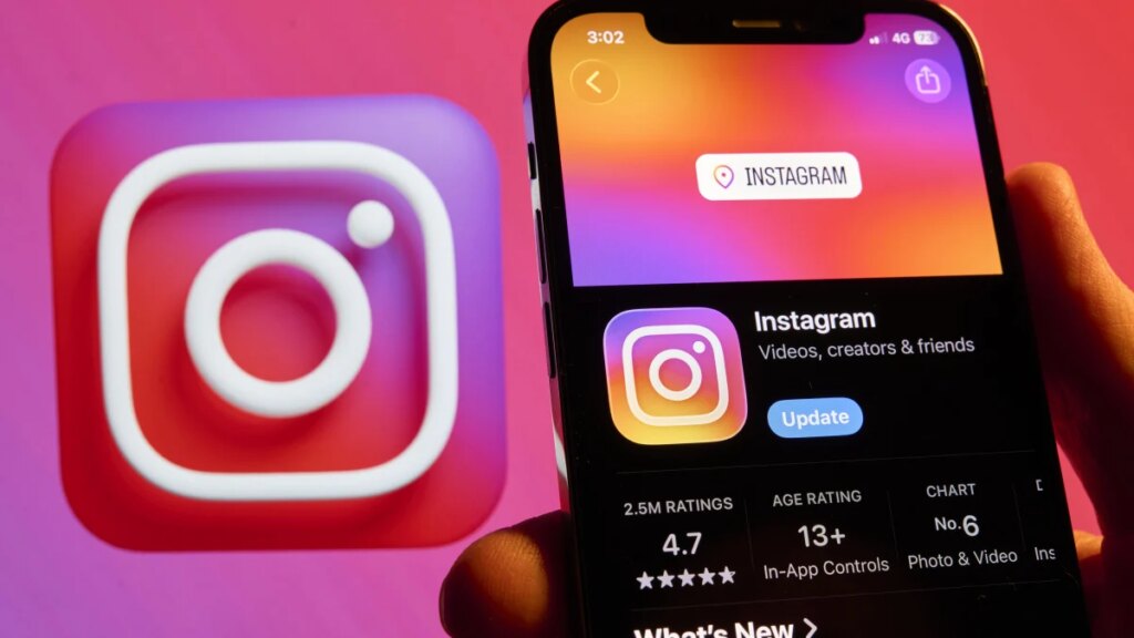
Instagram has unveiled a redesigned wordmark, the handwritten logo that appears at the top of its app, marking the first update to the text-based identifier in a decade. The familiar gradient camera icon remains unchanged.
Announced by Instagram head Adam Mosseri on Aug. 13, the refresh aims for a “cleaner and more modern” look while preserving heritage cues. Director of product design Jasmine Probst said the script style reflects individuality, with the new mark bolder, simpler, and featuring unexpected touches that signal personal expression. The redesign followed exploration of hundreds of concepts, including all-caps and camera-inspired designs, before returning to a hybrid script blending cursive and print lettering.
The wordmark is part of a broader brand system overhaul that includes an updated Instagram Sans typeface and two new fonts: the hand-drawn Instagram Pen and the monospaced Instagram Mono. The rollout also brings refreshed motion, layouts, and a more restrained application of Instagram’s signature gradient. The changes are deploying globally now, with additional updates scheduled through 2026 and beyond.
Reaction online has been mixed. Many users struggled to discern a significant difference, questioning the need for a refresh. Others pointed to the distinctive shapes of the “s” and “r,” joking that the logo now reads “Instagzam.” On the design-focused subreddit r/logodesign, critics labeled the hybrid script “fan-made” and an “unsettling mix of manuscript and cursive,” dubbing it a “sidegrade” or “zidegrade.” Conversely, some praised the half-cursive approach as stylish and readable, viewing it as an improvement over the previous mark. Observers also noted the update aligns Instagram with a minimalist branding trend adopted earlier by other major platforms.
The refresh signals Instagram’s effort to modernize its visual identity while reinforcing its core emphasis on individual expression. As the new typography system and motion language roll out over the coming years, the platform will test whether a subtler wordmark can sustain its iconic status in a crowded social media landscape.